
 Colours affect people and their behaviour in different ways. This impact has a place in Psychology and is known as Colour Psychology. Behavioural Psychology is a broader term of which colour psychology forms a part.
Not many people believe in behavioural psychology. This stems from the fact that the field is not yet that popular and the theories are quite difficult to test. There are not many claims to prove the results scientifically. People need evidence and there is a lot of research lined up for proper evidence to be laid out.
That said and done, it cannot be denied that colours significantly influence our emotions. On witnessing a colour, our eyes communicate with a part of our brain, which is called the hypothalamus, which in turn, sends signals to release hormones. This leads to a change in mood, emotion and behaviour. Haven’t we all gone through different phases of needing different colours in our lives? This tells us why.
Market surveys and research show that more than 85% of the times, people end up buying products based on the colours in the logo. This is the reason why choosing your logo colours would decide whether your logo would run or sink. This is the point where careful inspection and research can help your business to thrive.
While choosing the right colour, the product alone would not help in deciding what is to be done. The audience at the receiving end is your foundation. The two sexes generally do not prefer the same colours. While a man might like blue, a woman might prefer pink. The same applies to the category of children. They have a different set of likes and dislikes, altogether. A proper study of product groups and colours are very essential in this field.
Let us take a look at the significant colours and their application in logo designs:
A Splash Of Blue!
Blue represents corporate America. It is a favourite among both men and women. It is also one of the most popular colours in logo designing. Blue is often associated with a sense of calm. It also signifies trust, peace, harmony, order, security and serenity. There is a direct link between the colour and reasoning. The mind thus associates it with logic and communication.
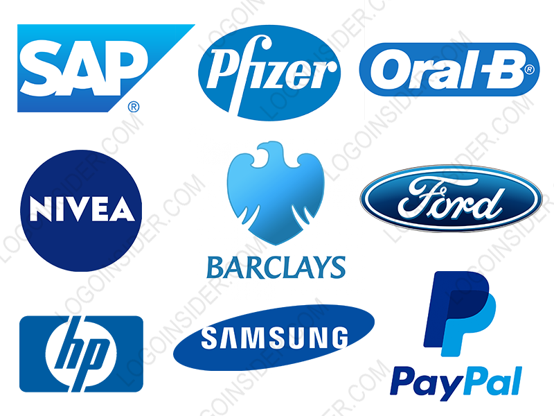
It doesn’t come as a surprise that the world’s largest social networking site, Facebook, uses the colour blue for its entire website. LinkedIn and Twitter run on the same lines. When people update their personal and professional information on a social portal, the first thing that they look for is security. Blue tends to send a positive vibe in that regard.
Which other companies need their customers to feel secure and confident about their involvement? The ones that deal with people’s money and their future savings. Trust is an important factor here and people look for a secure mode of communication.
Where should blue not be used? In the food industry! Why? That’s because blue does not look appetising, as a colour, to be used with food. It has often been associated with food poison and such, in movies.
Which shade of blue should be used is also a significant factor. A royal blue or a cobalt, a turquoise or a powder blue; using the wrong tone can make the brand logo look aloof and unapproachable.
A Bright Yellow!
Yellow has generally been associated with warning signs. Its visibility is the highest in daylight. That is the reason traffic signs are mostly yellow in colour. Places where permanent obstacles or important notices need to be highlighted, yellow and black stripes are commonly used because of the vibrancy.
Yellow logos spell happiness, fun and frolic, optimism and playfulness. There is general cheerfulness around the colour. Yellow, in combination with other colours, is a hot favourite among kids. The world’s largest fast food company uses yellow in its logo and kids are naturally drawn to the colour, for all the fun that they could have in the stores!

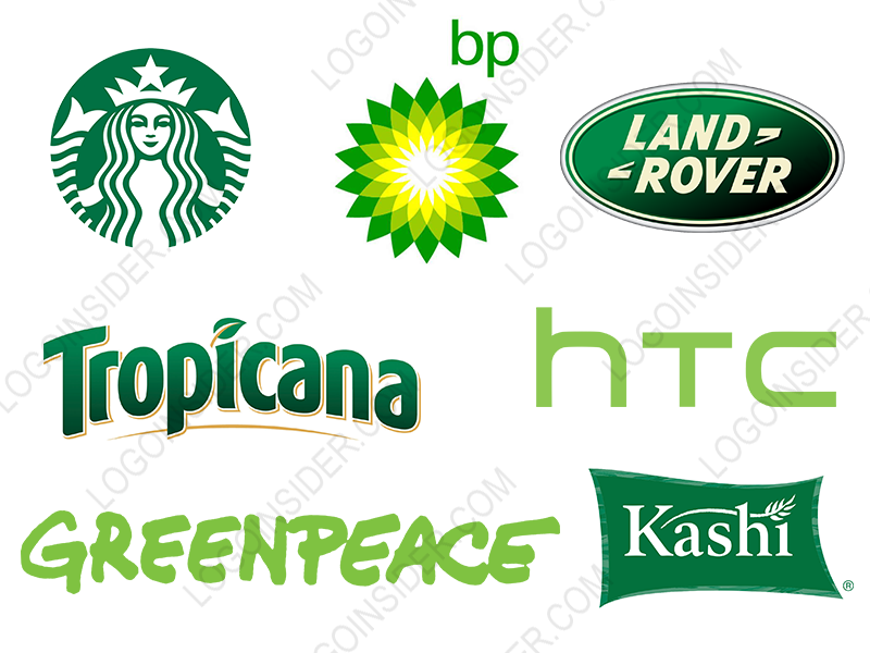
A Soothing Green!
Green is directly linked with environment, sustainability, nature and natural things. If your company deals with environment friendly products or bio-degradable things, green is your colour! Use green in your logo to draw the attention of people who believe in preserving the environment.
Green also works well for creative pursuits; so industries dealing with creative products could also use green in their logos. Additionally, green also stands for money, so money related ventures could use it as well.
Orange Glow!
Orange is all about energy, fun, physical activity and good stimulation. Sports teams and children’s products widely use this colour. Amazon uses orange in their logo and their website that might provoke you to indulge in active shopping online. To put it in simple words, orange means more activity and less stagnation.

Thanks to Amazon, orange has come to be associated with products that are cheap and affordable. So if your company deals with products that are affordable by commoners, you could use orange for your logo.
A Vibrant Red!
Red stands out as a colour because of its rich, intense impact on people. It can be linked to energy, passion, excitement and physical courage. The colour red is used by several food and beverage companies to promote appetisers and energy drinks. It can also stand for speed and power that is used by car companies to promote their products.

A Rich Purple!
Purple represents quality, loyalty, luxury and wisdom. The unknown, divine, mysterious and spiritual elements of advertising can also use purple as a representative. Since it is not a natural colour, it can also be used to denote things that are exotic or artificial.
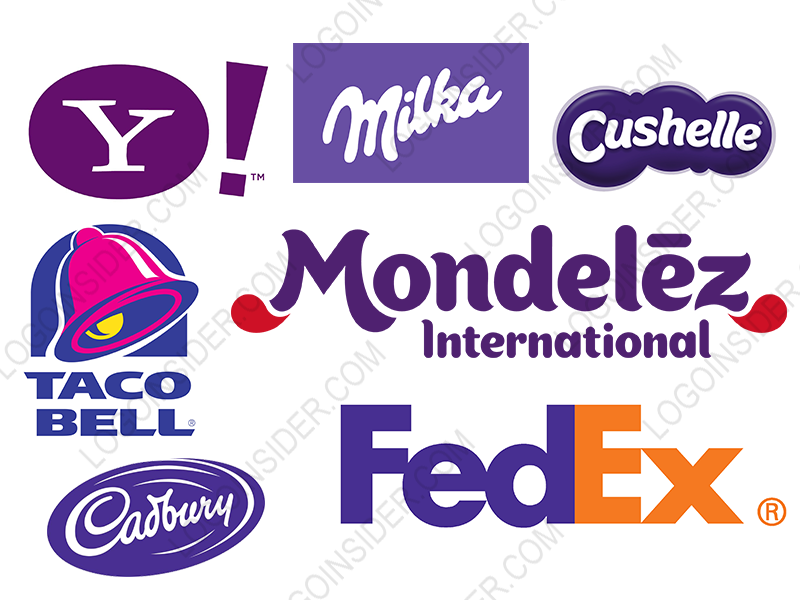
Having a polarizing impact on people, it is not always a colour that they warm up to. People mostly find it annoying and arrogant. Among other colours, purple lies at the shortest frequency of wavelengths visible to the human eye. This makes it difficult to work with and most companies generally avoid using the colour for their logos.
Timeless Black!
Black represents power, glamour, sophistication, elegance and exclusiveness. There is a certain luxury associated with the darkest shade of black. It also represents timelessness, which is why products of high value tend to have black logos.
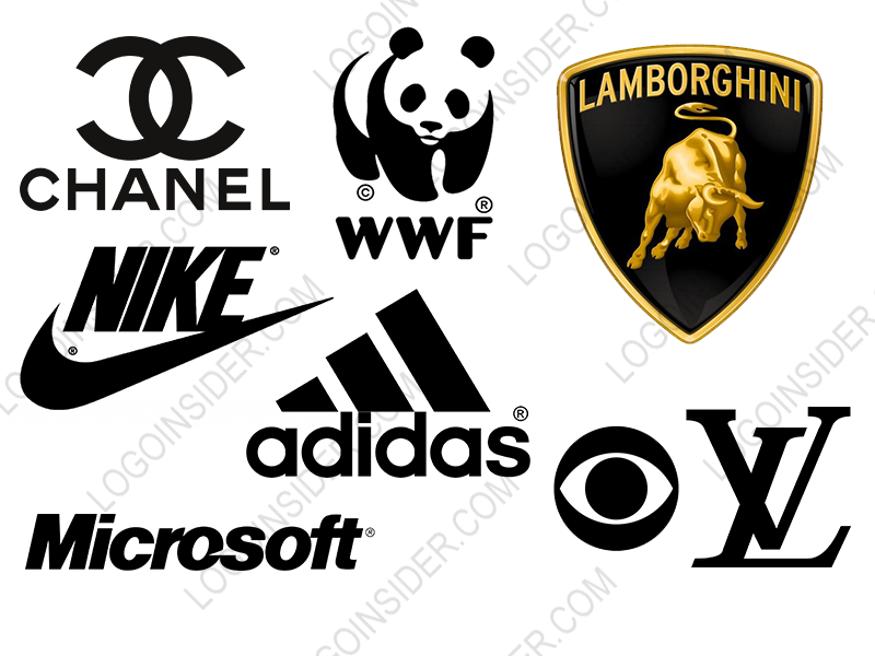
It is a no-nonsense colour that people associate with serious issues, movie villains and comic book criminals. It is also the face of death and mourning.
Premium hand bag manufacturers, like Louis Vuitton, Chanel and Dior use black as their primary colour. Owing to its image of an intense colour, most people would not mock at your purchase of a luxury bag that costs thousands of dollars.
For high-end luxurious products, vintage products and timeless pieces of art, black is the best choice.
A Sweet Pink!
Pink is the colour that represents femininity, love and affection. Most feminine products use pink in their logos to assert a sense of positivity around it. While a lighter shade of pink would target children and teenagers, a darker shade would take on a sexual appeal for the adults.

Woody Brown!
Brown is often used by companies to showcase their reliability, safety and dependability. It comes across as a warm colour that helps settle and welcome people.
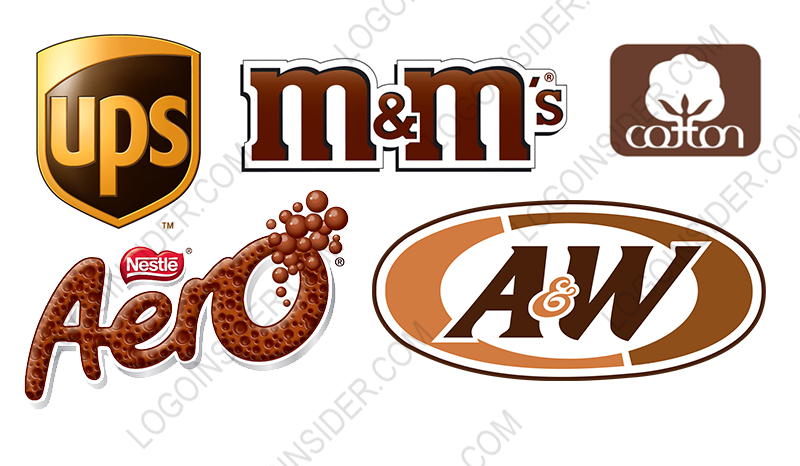
Brown brings irresistible desserts to the mind; a bar of chocolate, a warm nutty brownie, a gooey chocolate mousse or richly flavoured coffee. It is easy for customers to identify the contents of a package that has a brown logo.
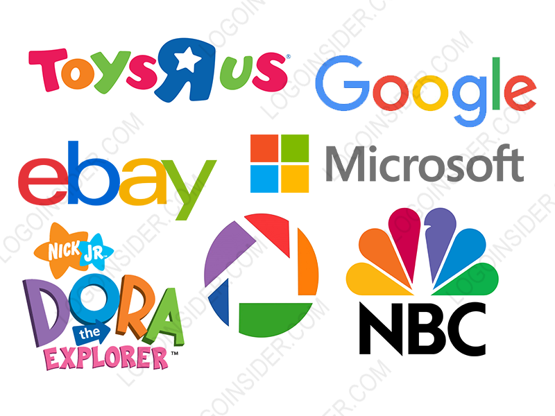
Rainbow Colours!
Multicoloured logos are highly popular across all ages. They represent unity in diversity. There is a certain spark to logos that have different colours combined together. It draws the attention of people.
Conclusion:
Even if there is not much evidence to prove how colours influence our lives, we cannot help but agree to most of the influences listed above. There is a subconscious element working in us while we pick products from stores.
Our choices are almost always influenced by the colours we like and this is what logo designers should keep in mind. Logos should be designed on the basis of what is generally accepted and what is not. This will mean better branding and better business potential.

